Explore the enduring impact of segregation maps on American cities and communities. This comprehensive guide helps U.S. searchers understand how historical redlining and contemporary data visualizations illuminate patterns of racial and economic division. Discover why these maps matter for urban planning, social justice, and informed decision-making. Learn where to find historical documents, interpret modern demographic maps, and grasp the complexities of neighborhood disparities. We provide clear insights into what segregation maps show, their relevance in current discussions about equity, and how to use this knowledge to better understand the social fabric of the United States. Navigate resources to compare community demographics and gain a deeper appreciation for the factors shaping our neighborhoods today. This resource is designed to help you decide, find, compare, and engage with critical information about residential segregation across the nation.
- What exactly defines a segregation map? - A segregation map visually displays the distribution of different population groups, often by race or income, within a geographic area. It highlights patterns of residential separation, illustrating concentrations of specific demographics and revealing historical or ongoing divisions within communities.
- How do you locate historical redlining maps? - Historical redlining maps, particularly from the HOLC era, can be found through university digital archives like the 'Mapping Inequality' project by the University of Richmond. Local historical societies and specialized research centers also often host digitized collections specific to their regions.
- What are the main causes of neighborhood segregation? - Neighborhood segregation stems from a mix of factors including historical discriminatory policies like redlining, economic inequalities, housing market dynamics, zoning laws that limit housing types, and individual choices. These elements combine to perpetuate residential divisions.
- Can I see current demographic segregation data? - Yes, current demographic segregation data is available through resources such as the U.S. Census Bureau and the American Community Survey (ACS). Websites like data.census.gov or social explorer allow users to create maps visualizing contemporary population distributions and socioeconomic indicators.
- What role does policy play in segregation patterns? - Policy plays a significant role in segregation patterns, both historically through discriminatory laws like redlining and currently through zoning regulations, housing finance, and public investment decisions. Policies can either exacerbate or mitigate residential divisions, making them crucial for shaping equitable communities.
- Are there tools to analyze segregation near me? - Yes, you can analyze segregation patterns near you using online tools provided by the U.S. Census Bureau or through data platforms from research institutions. Many city planning departments or non-profits also offer interactive maps and reports specific to local demographic distributions, accessible by zip code or city name.
- Why is it important to learn about residential segregation? - Learning about residential segregation is important because it reveals the systemic roots of many social and economic inequalities. Understanding these patterns helps individuals comprehend disparities in education, health, wealth, and access to opportunities, fostering informed engagement in community development and social justice efforts.
What is the primary purpose of a segregation map?
A segregation map primarily visualizes the geographic distribution of different population groups, typically by race or socioeconomic status, within a region. Its purpose is to highlight patterns of residential separation, illustrating how historical policies and ongoing societal dynamics have shaped the demographic makeup and resource access in various neighborhoods across the United States. This tool helps identify disparities and inform efforts for greater equity.How do redlining maps relate to current segregation?
Redlining maps from the 1930s systematically denied investment in predominantly minority neighborhoods, creating a foundation for persistent racial and economic segregation. These historical maps directly relate to current segregation by illustrating the origins of disinvestment, lower property values, and limited opportunities in areas that remain disadvantaged today. The legacy of redlining continues to influence urban disparities.Where can I view historical segregation maps for my city?
You can view historical segregation maps, specifically redlining maps, for many U.S. cities through online archives like the "Mapping Inequality: Redlining in New Deal America" project from the University of Richmond. Local university libraries, historical societies, and city archives also often host digitized collections. A quick online search for "[Your City] redlining map" can direct you to relevant resources.What data points are used to create modern segregation maps?
Modern segregation maps typically use data points from the U.S. Census Bureau, including the American Community Survey (ACS). Key data points include racial and ethnic composition, income levels, poverty rates, education attainment, and housing characteristics. These statistics, often combined with geographic information systems (GIS), help visualize and analyze contemporary patterns of residential separation and inequality.Why do some neighborhoods remain segregated in the US?
Neighborhoods remain segregated in the U.S. due to a complex interplay of historical policies like redlining, ongoing economic inequalities, housing market dynamics, exclusionary zoning laws, and individual preferences. These factors collectively limit opportunities for integration and perpetuate patterns of racial and socioeconomic division. Addressing these issues requires comprehensive policy interventions and community engagement.Can I use a segregation map for urban planning insights?
Yes, segregation maps are highly valuable for urban planning insights. They help planners identify areas with significant disparities in resources, infrastructure, and opportunities. This information can guide decisions on allocating resources, developing affordable housing, improving public transit, and designing more equitable community development projects, fostering inclusive growth and addressing historical inequities.Segregation Map: Uncovering Historical and Current Community Divisions in the US
Understanding a segregation map offers profound insights into the social and economic landscape of American communities. These maps are powerful tools, revealing historical and contemporary patterns of residential separation, often along racial or economic lines. For anyone seeking to comprehend the foundational structures influencing today's neighborhoods, grasping how these maps came to be and what they represent is essential.
This article guides you through the complexities of segregation maps, from their origins in practices like redlining to their modern-day relevance in urban studies and policy discussions. We will help you navigate available resources, interpret key data points, and understand the lasting impact these divisions have had across the United States.
Our goal is to provide clear, actionable information, enabling you to explore these vital resources, whether for academic research, community advocacy, or simply to better understand the world around you. This knowledge empowers individuals to engage more effectively with discussions about equity and urban development.
What Exactly is a Segregation Map?
A segregation map is a visual representation illustrating the geographic distribution of different population groups within a city or region. These maps highlight areas where specific demographic groups, such as racial or ethnic communities, are concentrated or underrepresented, indicating patterns of residential separation. They can reveal how historical policies and societal forces shaped the physical layout of neighborhoods and continue to influence them.
Historically, these maps were sometimes created as tools to enforce or predict segregation, such as the infamous redlining maps. Today, researchers and activists use similar mapping techniques to analyze disparities, inform policy, and promote a more equitable understanding of urban spaces. They serve as critical instruments for examining social equity.
By looking at a segregation map, one can observe the visible legacy of past decisions and ongoing societal dynamics that shape access to resources, opportunities, and quality of life across different areas. These visual aids are crucial for discussions about community development, resource allocation, and addressing historical injustices in the United States.
How Do Segregation Maps Work and What Do They Show?
Segregation maps function by plotting demographic data onto geographical areas, often using color-coding or shading to denote concentrations of specific groups. They draw upon various datasets, including census information, housing records, and socio-economic indicators. The visual patterns that emerge highlight areas of high homogeneity or stark differences in population composition.
These maps can illustrate a range of demographic characteristics, from racial and ethnic makeup to income levels, education, and housing types. By layering different data points, a segregation map can offer a multidimensional view of a community's structure, revealing correlations between residential patterns and access to amenities, schools, and employment opportunities.
They vividly display how historical policies, economic forces, and individual choices collectively contribute to the formation and perpetuation of segregated neighborhoods. Examining these maps provides essential context for understanding urban challenges and developing targeted solutions for community improvement.
Historical Redlining Maps and Their Impact
Redlining maps were a prominent form of segregation map used from the 1930s to the 1960s by the Home Owners' Loan Corporation (HOLC) in the United States. These maps categorized neighborhoods into different risk levels for mortgage lending, with areas deemed high-risk (often predominantly minority neighborhoods) outlined in red. This practice effectively denied investment and financial opportunities to these communities.
The impact of redlining was profound and long-lasting, contributing to decreased property values, limited access to loans for homeownership and business development, and a cycle of disinvestment in redlined areas. This systemic exclusion of capital exacerbated racial and economic segregation, creating disparities that persist in many U.S. cities today.
These historical segregation maps are crucial for understanding the roots of modern urban inequality. They demonstrate how institutionalized discrimination shaped the built environment, influenced generational wealth accumulation, and continues to affect public health, education, and infrastructure in countless American neighborhoods.
Modern Segregation Patterns and Data Sources
Today, while overt redlining is illegal, residential segregation persists through more subtle mechanisms, including housing policies, economic factors, and individual preferences. Modern segregation maps draw on diverse data sources to reveal these current patterns. The U.S. Census Bureau provides detailed demographic information, allowing researchers to track population shifts and concentrations.
Data from sources like the American Community Survey (ACS) offers up-to-date insights into income, poverty, education, and housing characteristics at various geographic levels. Combined with mapping software, this data helps visualize how neighborhoods continue to be divided, often mirroring historical patterns but also adapting to new socio-economic realities. Tools like the Diversity Index or Dissimilarity Index further quantify these patterns.
Understanding modern segregation requires examining a combination of quantitative data and qualitative community experiences. These maps are vital for identifying areas needing targeted interventions, informing fair housing initiatives, and promoting equitable development across the country in 2026 and beyond.
Where Can You Find and Explore Segregation Maps Online?
Accessing segregation maps online is crucial for anyone looking to delve into the history and current state of American communities. Several reputable institutions and platforms host valuable resources, making it easier than ever to explore these complex historical documents and modern data visualizations. Whether you are a student, researcher, or concerned citizen, these resources provide rich information.
For historical redlining maps, universities and research initiatives have digitized extensive collections. Projects like "Mapping Inequality: Redlining in New Deal America" from the University of Richmond offer interactive maps that allow users to zoom into specific cities and view original HOLC documents. Other historical societies and local archives also provide access to city-specific historical maps detailing neighborhood development.
For current demographic segregation patterns, resources from the U.S. Census Bureau are invaluable. Platforms like Social Explorer or PolicyMap allow users to create custom maps using recent census and ACS data, visualizing various demographic and socio-economic indicators. Many urban planning departments and non-profit organizations also publish reports and interactive maps focusing on contemporary segregation in their local areas.
Accessing Historical Segregation Data for Your City
To access historical segregation data for your specific city, begin by checking the "Mapping Inequality" project website. This platform provides an extensive collection of digitized Home Owners' Loan Corporation (HOLC) maps, often referred to as redlining maps, for dozens of major U.S. cities. You can search by state and city to find detailed neighborhood assessments from the 1930s.
Additionally, many university libraries with strong urban studies or history departments have curated collections of local historical maps and archival documents. Performing a specific search for "[Your City] redlining map" or "[Your City] historical segregation data" often yields results from local historical societies, public libraries, or specialized research centers.
These resources typically provide not only the visual maps but also accompanying neighborhood descriptions, offering crucial context on how areas were evaluated based on racial composition, property conditions, and perceived stability. Exploring these records gives a direct look into the discriminatory practices that shaped urban landscapes.
Understanding Current Demographic Maps Near Me
To understand current demographic maps and segregation patterns near you, start with official U.S. Census Bureau data. Their website provides access to the American Community Survey (ACS) data, which offers granular demographic, social, economic, and housing information down to the neighborhood level. Tools like Census Reporter or data.census.gov allow for custom data queries and map generation.
Several non-profit organizations and research institutions also create interactive maps that visualize current segregation. For example, sites focusing on social equity or fair housing often feature dashboards or mapping tools that illustrate contemporary disparities. You can typically search these platforms by zip code or city to see local demographics.
Additionally, many city planning departments and regional councils publish demographic profiles and maps for their jurisdictions, often highlighting areas of concentrated poverty or racial homogeneity. Exploring these local government resources can provide immediate, localized insights into segregation patterns in your specific area, allowing for a better understanding of community composition.
Why is Understanding Segregation Maps Important Today?
Understanding segregation maps is critically important today because they provide a visual foundation for comprehending persistent inequalities in American society. These maps illustrate how historical policies, like redlining, created lasting disadvantages for certain communities, shaping access to wealth, education, healthcare, and environmental quality. Recognizing these patterns is the first step toward addressing them.
They are essential tools for urban planners, policymakers, and community advocates working to foster more equitable cities. By pinpointing areas with significant disparities, segregation maps help in designing targeted interventions, advocating for fair housing initiatives, and directing resources to underserved neighborhoods. They reveal the systemic roots of many contemporary social issues.
Furthermore, these maps promote civic engagement and informed public discourse. When citizens understand the historical and ongoing impact of segregation on their own communities and across the nation, they can participate more effectively in local governance, support reforms, and contribute to building more inclusive and just societies.
How to Interpret and Utilize Segregation Map Information
Interpreting segregation map information effectively involves more than just looking at colors or shades. It requires understanding the data sources, the methodology used to create the map, and the historical context. Look for clear legends, population density indicators, and specific demographic metrics being represented, such as racial composition, income levels, or housing tenure.
To utilize this information, consider it a starting point for deeper inquiry. If a map shows high concentrations of a particular group in one area, research the history of that neighborhood. What were the historical zoning laws? Were there major infrastructure projects that divided communities? How do local school districts or public services compare across different mapped areas?
This data can inform community action. For instance, if you're involved in local advocacy, these maps can highlight areas needing investment, better public transportation, or improved healthcare access. They provide compelling visual evidence to support proposals for policy changes, urban redevelopment projects, or social justice initiatives, helping to guide efforts toward creating more equitable opportunities for all residents.
Exploring Local Equity Issues Through Segregation Maps Near Me
Exploring local equity issues through segregation maps near you can begin by focusing on your immediate surroundings or specific neighborhoods of interest. Utilize the online resources mentioned previously, such as the U.S. Census Bureau's data tools or university-led historical mapping projects, to pull up information relevant to your city or county. Pay attention to how different demographics are distributed.
Once you have a local map, consider layering additional information you can find, like school district boundaries, public park locations, access to grocery stores, or even environmental hazard sites. Many local governments or non-profits provide data dashboards that can help overlay these different factors, revealing how segregation patterns correlate with disparities in community resources and quality of life.
This localized analysis can highlight specific areas where disparities are most pronounced. For instance, you might observe that neighborhoods historically redlined still lack green spaces or have fewer high-performing schools. Such insights can inform targeted community initiatives, local policy discussions, or simply enhance your understanding of the ongoing challenges and opportunities within your own region.
Segregation maps are more than just historical artifacts; they are living documents that continue to inform our understanding of American society. By exploring these powerful visualizations, individuals can gain a deeper appreciation for the complex interplay of history, policy, and demographics that shape our neighborhoods. This knowledge is not just for academics but for every citizen eager to contribute to a more just and equitable future.
Whether you are researching past injustices, analyzing current urban dynamics, or advocating for change in your local community, the information provided by segregation maps is indispensable. We encourage you to utilize the resources discussed to explore these maps further and to engage with the critical discussions they spark about community development and social justice across the United States. Your exploration is a valuable step towards informed civic participation and fostering a society where opportunities are accessible to everyone.
By understanding what these maps reveal, you are better equipped to challenge existing inequalities and work towards creating communities that are truly inclusive and offer equitable access to resources and opportunities for all residents, moving forward into 2026 and beyond.
segregation map meaning US, historical redlining maps online, modern urban segregation patterns, finding community demographic data, understanding housing discrimination impacts, how to interpret segregation maps, social equity mapping tools, neighborhood disparity insights
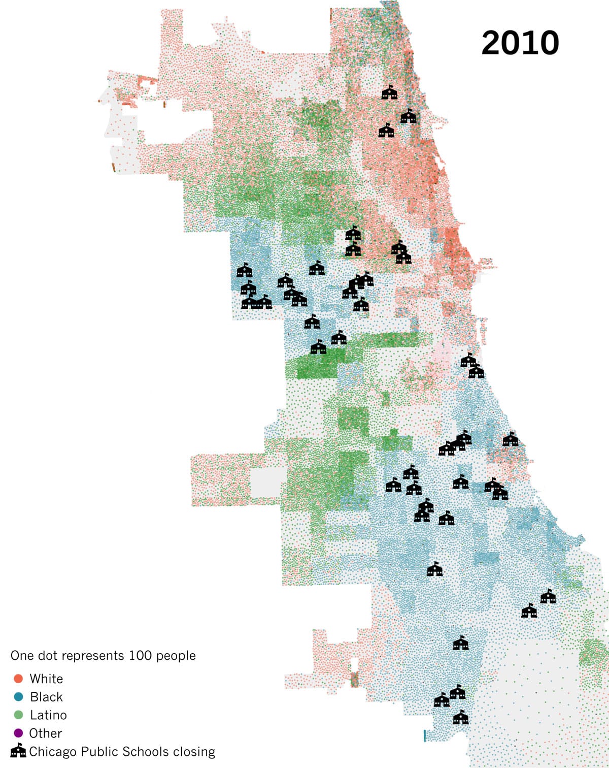

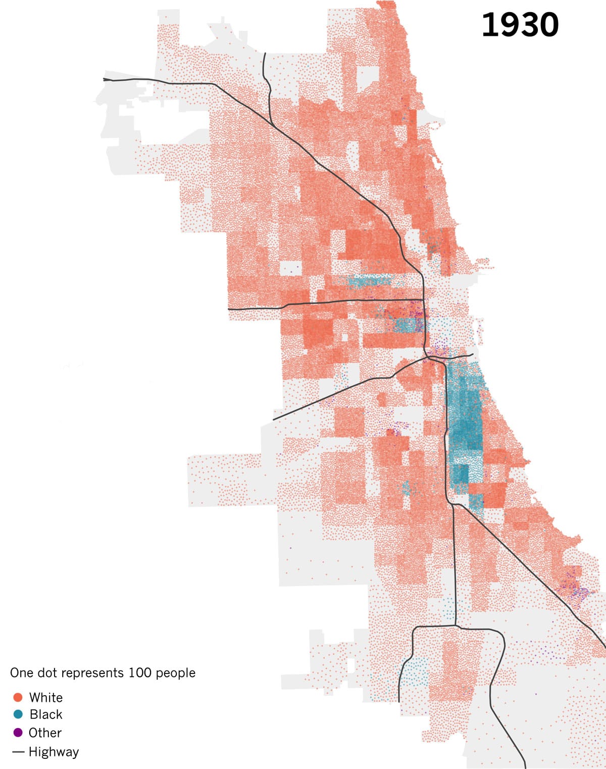

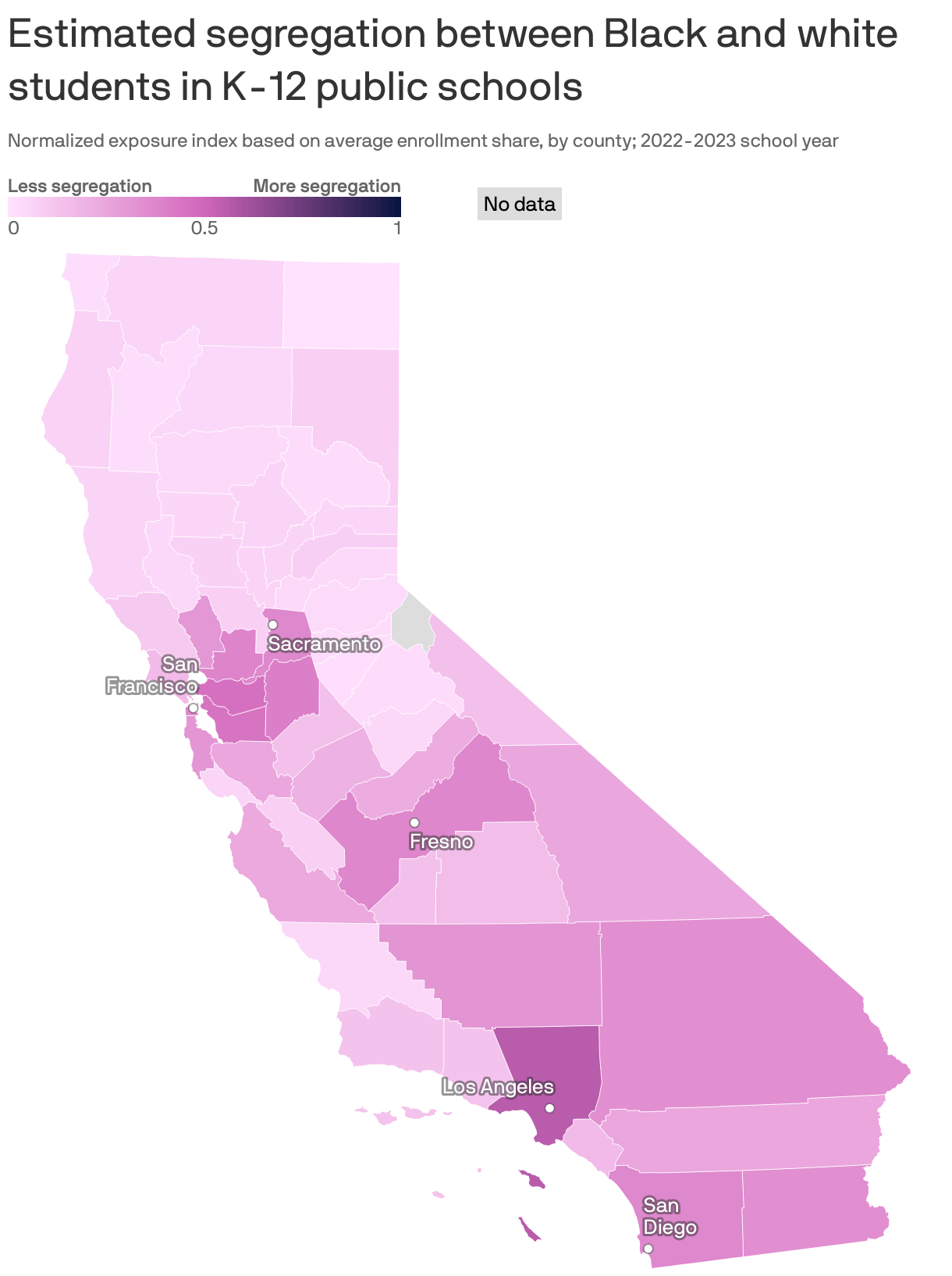
Mapping Chicago S Racial Segregation FIRSTHAND Segregation WTTW Segregation 2010 Map 01 01 . 5 Takeaways On School Segregation 70 Years After Brown V Board KQED Image4 1020x574 . Mapping Chicago S Racial Segregation FIRSTHAND Segregation WTTW Segregation 1930 Map 01 01 . Infographic A Map Of Racial Segregation In America Fast Company 1673284 Poster 1280 Mappeople . Racial Segregation Is Rising In San Diego Schools 70 Years After Brown Full
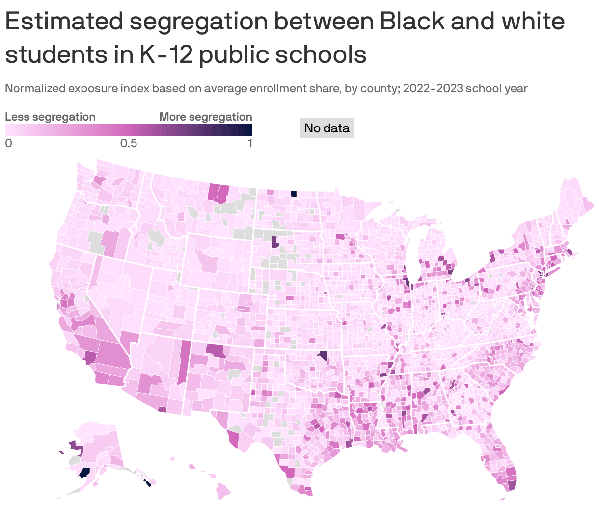


/cdn.vox-cdn.com/uploads/chorus_asset/file/675050/Screen_Shot_2014-08-28_at_11.23.18_AM.0.png)
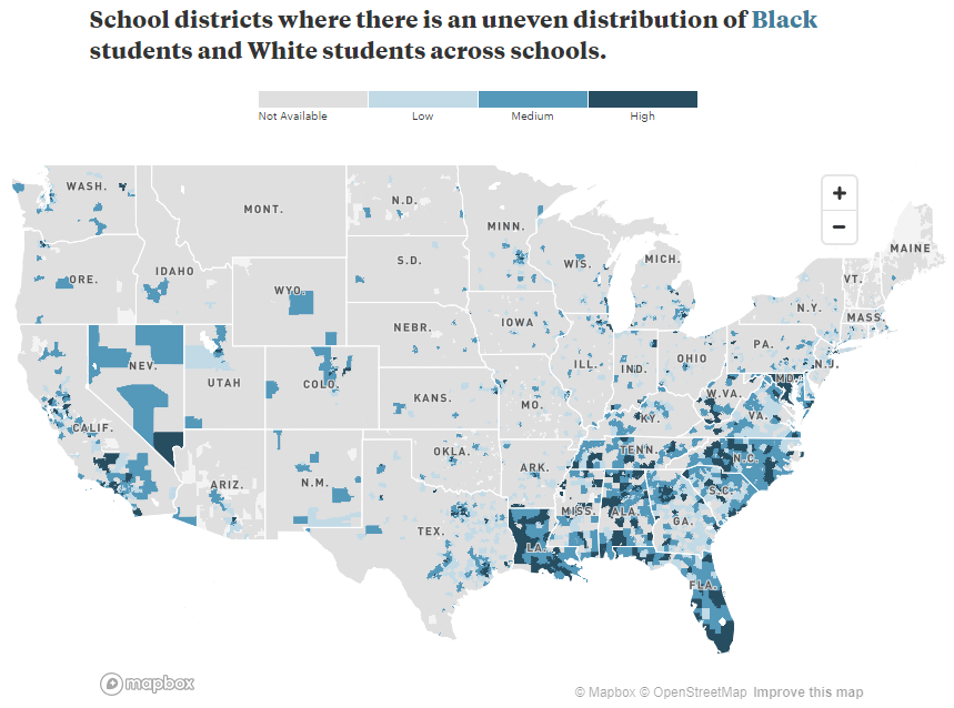
Louisiana S Most Segregated School Systems Mapped Axios New Orleans Full . Where School Segregation Is Still Happening Across The US Digital Journal Us School Segregation Map 01 . Interactive Map Inside U S School Segregation By Race Class The 74 SXSW Finance Lead 2 . 3 Maps That Show School Segregation In The US Vox Screen Shot 2014 08 28 At 11.23.18 AM.0 . Still Separate Still Unequal Teaching About School Segregation And Jumbo V2



Segregation Map America S Cities 50 Years After The Fair Housing Act DC Map 2016 600 . Equity Metrics Othering Belonging Institute Segregation Map Preview Image 16x9 . Segregation Map America S Cities 50 Years After The Fair Housing Act Segregation Us Cities Promo 2300 . Segregation Map America S Cities 50 Years After The Fair Housing Act Chicago Map 2016 280 . School Segregation Thrives In America S Most Liberal Cities F88eebfa Bc77 4d8b 8bdb 1440x1232


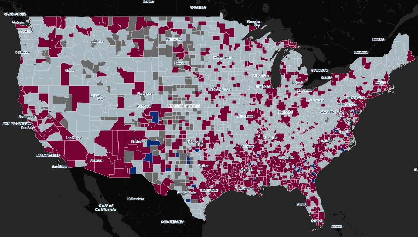

United States History I II Reading Assignment Civil Rights US 26 . The Cost Of Segregation Planning Council Image . Mapping Segregation The New York Times Chicago . What The 2020 Census Reveals About Segregation Othering Belonging Nationalmap . The African American Struggle For Civil Rights US History CNX History 28 05 Brown

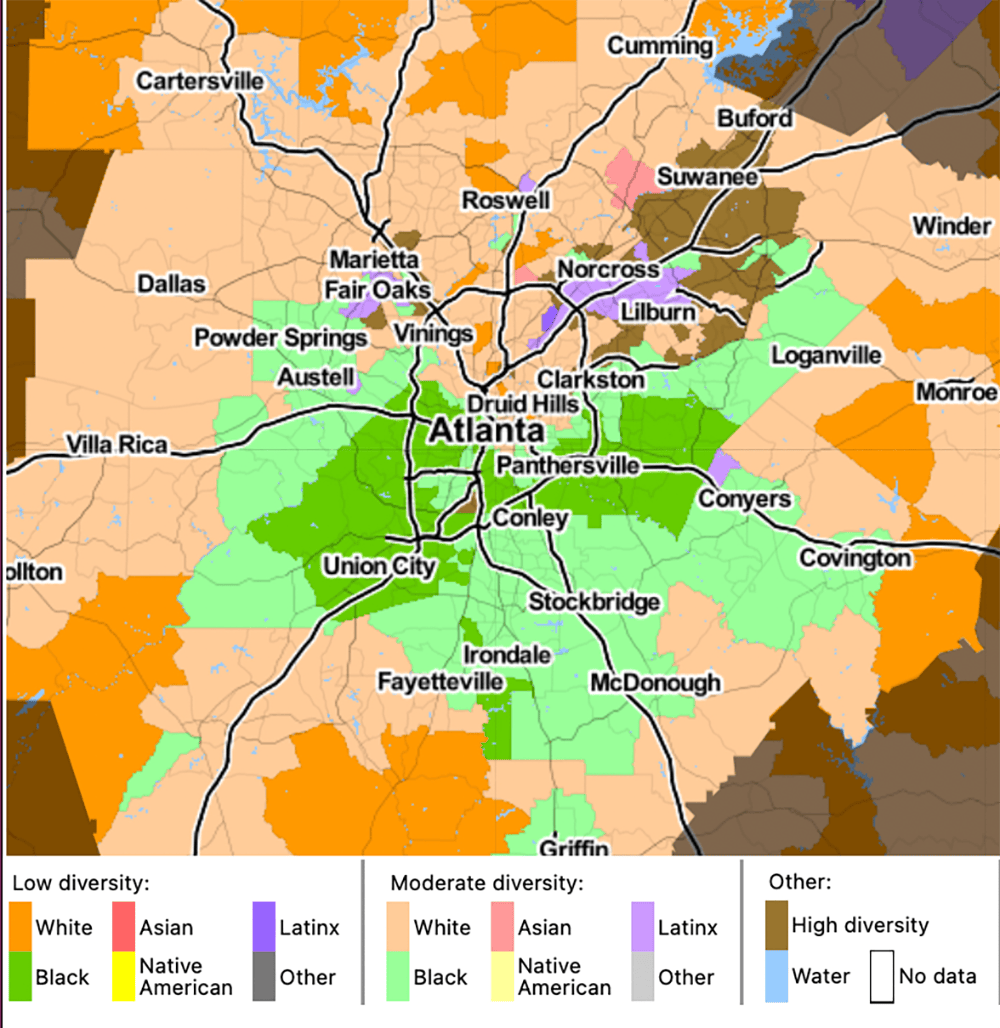


Mapping Segregation The New York Times . Mapping Inequality 2020map . Segregation Map America S Cities 50 Years After The Fair Housing Act HOU All 2016 . Segregated Cincinnati Center For Community Resilience Cc Most Segregated . Handout F Segregation Laws Map 1953 National Leader In Civic 5.6 Handout F Segregation Laws Map 1953 Img
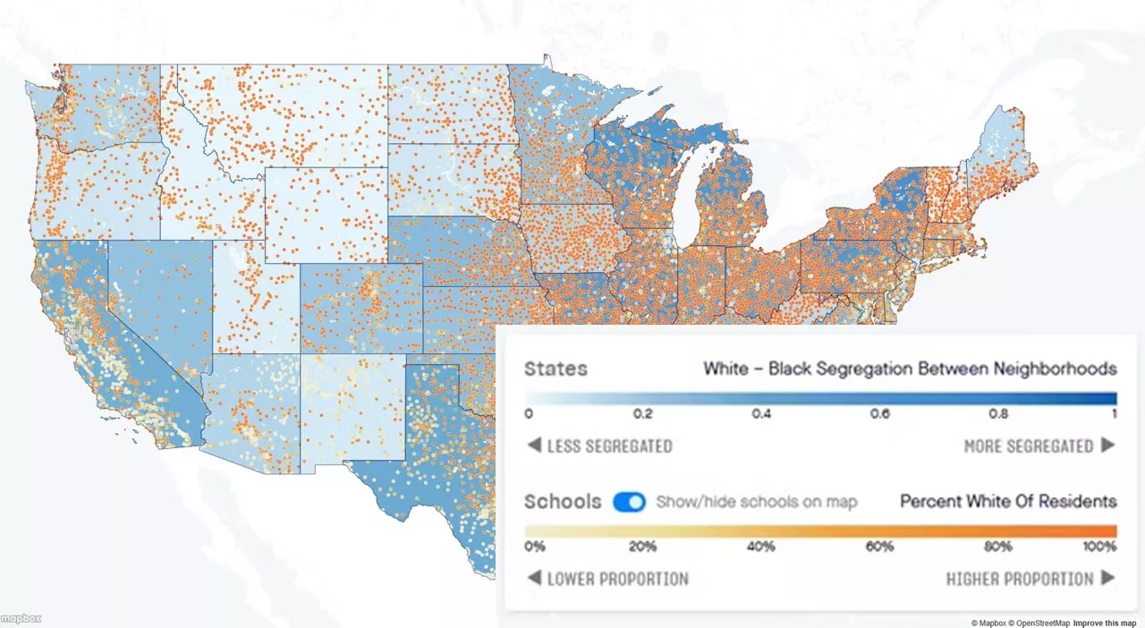


Visualizing Inequity The Data Behind Structural Racism State Residential Seg Final. Segregation Map America S Cities 50 Years After The Fair Housing Act Usa Sig . Segregation Map America S Cities 50 Years After The Fair Housing Act CHI All 2016 . Mapping Segregation The New York Times Census Race Map V2 . Segregation Has Been The Story Of New York City S Schools For 50 Years


Trump Dropped Policy Prohibiting Contractors From Having 21trump News Segregated Facilities1 V2 . The Roots Of Structural Racism Project Othering Belonging Institute Screenshot Of Segregation Map Showing Detroit . Segregation Map America S Cities 50 Years After The Fair Housing Act DC All 2016 . A Close Up Picture Of Partisan Segregation Among 180 Million Voters Partisan Dot Maps Promo . Civil Rights And African American Women Teaching With Segregation Country Map 1536x1111